
Hardness and Political Choices
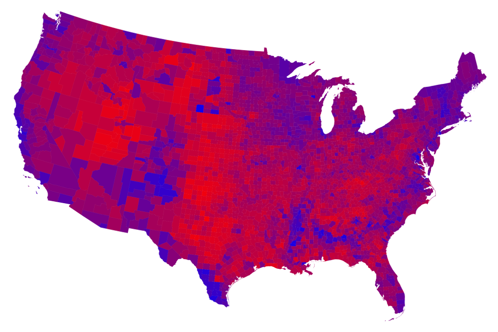
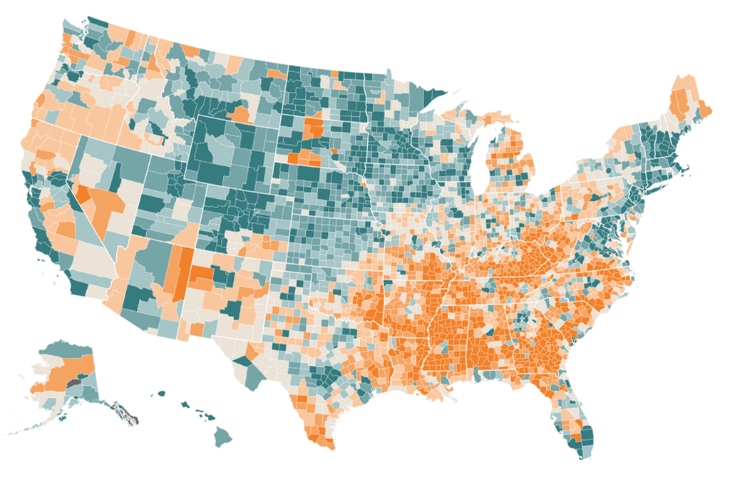
Left image: 2012 Election Results (1), Right image: Hardest Places to Live in the US (2).
A few weeks ago, the New York Times posted a great article on the hardest places to live in the United States, based on education, median income, unemployment rate, disability rate, and a few other factors. It is an incredible article, and I recommend reading it at nytimes.com. As soon as I saw their graphic, I immediately wondered if there was a connection between political persuasion and hardness. To look at this, I grabbed Mark Newman's version of the 2012 election results and a nice image comparator so that the two maps can be compared on top of each other. The results are interesting!
For clarification: On the election results (left), each district is colored on a gradient from blue to red based on percentage of the vote for the winning candidate (purple would mean an even split Obama/Romney). For the NYTimes hardness results (right), dzisctrics are colored on a gradient orange to green, where orange is worse (harder to live) and green is better.
What to make? I don't know. In the north-east (areas including New England, Kentucky, Michigan, Illinois, and parts of Virginia), it appears that the more liberal areas are usually the easier places to live, and the harder places to live are usually more conservative. However, in the mid-west (the entire middle of the country west to California), it appears to be just the opposite. In any case, it's interesting to think about!
References
1. Newman, Mark. "Maps of the 2012 US Presidential Election Results." N.p., 8 Nov. 2012. Web. 14 Oct. 2014. <http://www-personal.umich.edu/~mejn/election/2012/>.
2. Flippen, Alan. "Where Are the Hardest Places to Live in the U.S.?" The New York Times. The New York Times, 25 June 2014. Web. 14 Oct. 2014. <http://www.nytimes.com/2014/06/26/upshot/where-are-the-hardest-places-to-live-in-the-us.html>